The colors of Romania
October 19, 2019
This blog post explains how I created a detailed interactive map of European election results in Romania.
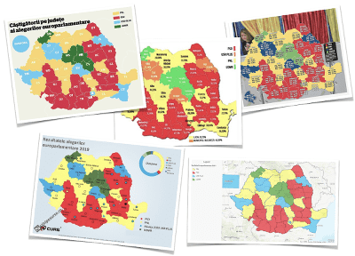
For the 2019 European Parliament elections most of the Romanian election maps presented the results on a county level:
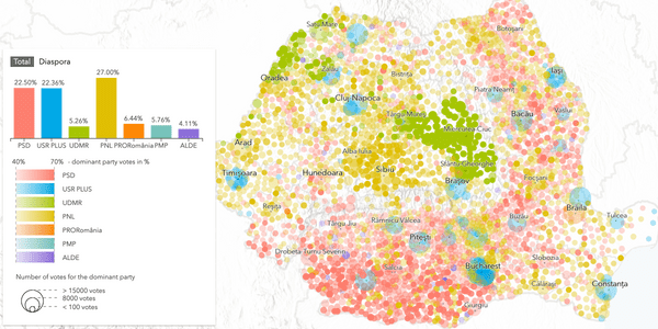
Which is great information, but as a Romanian, I’d like to see more details in these maps… are there any differences between cities and rural areas? within a county, are there any smaller regions that voted for a different party? And if a party is predominant within a county, did it win with a significant majority of votes? Another thing I noticed is that very few maps are interactive even if the content is served on the web. So I decided to create an interactive map where the results are mapped on smaller administrative units (also called communes, municipalities and cities in Romania). This is the final result:
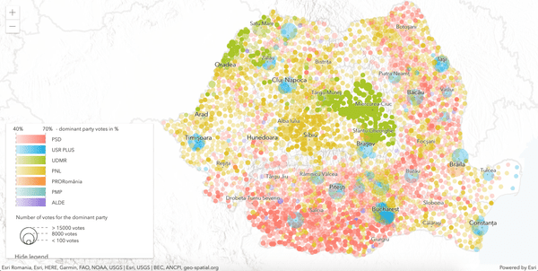
Map of 2019 European election results in Romania. Live version: https://raluca-nicola.net/romania-elections/. Github repository: https://github.com/RalucaNicola/romania-elections.
If you want to find out how I built it, then keep on reading! 🤓
My workflow when creating a map usually involves:
- finding an interesting story that I want to tell: what is the topic, what is the goal of the map, what is the target audience. This part defines the whole cartographic process. The message that I want to send and the audience I want to send it to, will drive the project, starting with the design all the way to choosing the technology and implementing the map.
- finding suitable data is an important step. There are many open data portals, specialized websites that provide geodata. However, once you found it, you’ll most certainly need to process it somehow: either convert to a different format, clean it, reproject to a new coordinate system, calculate new attribute fields based on existing ones etc.
- last but not least, you get to the fun part: designing the map and implementing it according to the decisions you took in the story-telling phase.
However, these steps are pretty much intertwined during the whole process. It can happen that I can’t find data for the story or I can’t build the map interaction the way I want to and this is why sometimes I go back and forth between these steps:
Based on this workflow, let’s have a look at how I built the election map.
Story
I want the users of my map to get an idea of how Romanians all over the country voted. The map should allow them to notice election patterns and ask themselves questions: why was this party predominant in this city? why is there a small part of the region that voted for a different party than the rest of the region? The map should be interactive so that the users can find out more information about each local administrative unit by clicking on it. They should also be able to filter the counties based on predominant party to get a better overview of where a certain party won. The app would be useful for Romanian citizens that are interested in election vote results. With these ideas in mind I proceed to the data hunt…
Data
Within the EU Nomenclature of Territorial Units for Statistics (also called NUTS — in case you never heard about this, you can read more here), counties are a NUTS-3 level regions. More detailed regions exist and they are called local administrative units (also known as communes, municipalities and cities). The geographic data for the local administrative units is available for download at the Geoportal of the National Agency for Land surveying. They are available as line or polygon, but for my visualization I converted them to points by calculating the polygon centroid. Then I added latitude and longitude as attributes and I exported them as .csv. I did this in ArcGIS Pro. For more details see Steps 1 to 3 in the data processing tutorial.
The election results are based on polling station and can be downloaded as a .csv file from BEC. For my map I needed to aggregate them to local administrative units and then join the attributes to the spatial data based on the name of the unit. I did this using pandas, a python library for data analysis that performs fast calculations on data frames. After joining the election results with the local administrative units, I also calculated the predominant party and the number of votes in absolute values and percentages. For more details see Steps 4 to 8 in the data processing tutorial.
Next, I also calculated the results from Diaspora and the total election results and saved them in a json file, just to display them in the bar chart.
Map
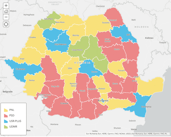
Election maps present the predominant party based on some administrative units like counties or municipalities. Most of the times this information is presented in a choropleth map (a map in which areas are colored/shaded or patterned proportionally to some statistical variable in those areas). There are many more types of thematic maps used to display election results, you can read more about them in this New York Times article. The Romanian media generally uses a choropleth map based on counties:
Map showing predominant parties in Romanian counties for European Parliament elections in May 2019
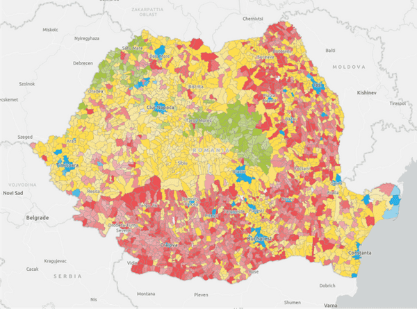
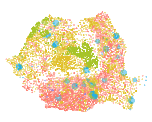
As I said before, this map is great for knowing which party won in each county. If we want to gain more insight and the possibility to discover regional patterns then we should show the results based on smaller administrative units like communes/cities/municipalities. So basically something like this:
Map showing predominant parties in Romanian municipalities/communes/cities for European Parliament elections in May 2019
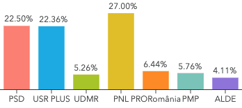
But if you look at this map you wouldn’t think that the party in blue gained as many votes as the party in red. However, the final results show it:
Parties with a majority of votes
This is a known issue with choropleth maps, they are biased by the area of the region. Small regions trick you into thinking that they are not important, but the majority of votes might come from there. So if we also want to show the number of votes the predominant party gained in each unit, there are other alternatives for maps. For my app I decided to go for a proportional symbols map because it allows you to map the number of votes on the size of the symbol. I also mapped the percentage of the votes on the opacity of the symbol. Like this, the user can see if the predominant party was chosen with a majority of votes (>70%), or if it was at the limit (<40%). And finally the color represents the party.
To create such a map with ArcGIS API for JavaScript, we first need to create a new layer. In the API there is a CSVLayer class that takes a csv file as input source:
const electionLayer = new CSVLayer({
  url: "./data/election_uat_final.csv",
  copyright: "BEC, ANCPI",
  title: "European Parliament Elections 2019 - Results in Romania"
});

map.add(electionLayer);
See this snippet in the final application.
Once this layer is created we can apply a renderer that will connect the attributes to the visual variables color, opacity and size. The renderer is a UniqueValueRenderer, meaning each party is a unique value that will be mapped to a symbol. The mapping looks like this:
partyCodes = [{
  name: "PSD",
  field: "g1",
  color: "rgb(253, 127, 111)"
}, {
  name: "USR PLUS",
  field: "g2",
  color: "rgb(0, 169, 230)"
}, {
  name: "UDMR",
  field: "g4",
  color: "rgb(167, 198, 5)"
}, ...];
And this is how we define the renderer:
const renderer = new UniqueValueRenderer({
  valueExpression: "$feature.pred_party",
  defaultSymbol: createSymbol("lightgray"),
  uniqueValueInfos: partyCodes.map(party => {
    return {
      value: party.field,
      symbol: createSymbol(party.color)
    }
  })
});

function createSymbol(color: string) {
  return new SimpleMarkerSymbol({
    color: color,
    outline: {
      width: 0
    }
  });
}
Now we need to map the percentage of the predominant party on the opacity and the number of votes on the size. We do this using OpacityVariable and SizeVariable:
renderer.visualVariables = [
  new OpacityVariable({
    valueExpression: "$feature.pred_percent",
    stops: [
      { value: 40, opacity: 0.3, label: "< 40%" },
      { value: 70, opacity: 1.0, label: "> 70%" }
    ]
  }),
  new SizeVariable({
    valueExpression: "$feature.pred_absolute",
    minDataValue: 100,
    maxDataValue: 15000,
    minSize: "10px",
    maxSize: "40px"
  })
];
The data is now displayed as we wanted, but it’s very hard to say where is what:
It needs more context data. In thematic mapping, context data is provided by a basemap. For this map I used a vector tile layer to add the borders of Romania and the neighbouring countries and the Black Sea. In addition I published 2 tiled layers for the administrative boundaries for counties and municipalities/communes/cities. The Carpathian mountains split the country in regions and they also mark the political landscape (the south votes differently than the center and the west). I wanted to show this, so I added the terrain hillshade layer that Esri provides for the whole world. Last but not least I added the main cities as another csv layer.
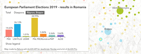
The UI is minimal, but very important. It’s supposed to work together with the map to show complementary information, like the final result of the election or the result of the elections for people who voted outside of Romania. The Legend explains how to read the map. In terms of interacting with the map, two actions are particularly important:
- being able to zoom in and click on the municipalities to get more information:
- have an interactive legend that on hover highlights the municipalities/communes/cities where that party is predominant:
Just in case you were wondering, I made the legend and the bar charts with D3.
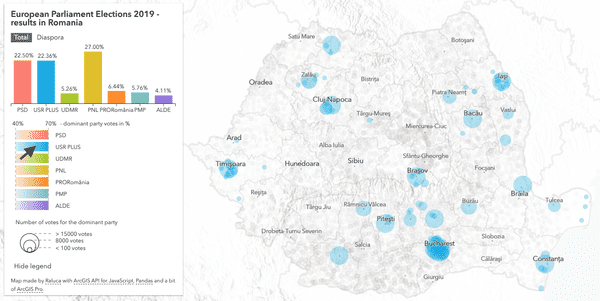
And this is what the final map looks like, you can explore it live here.
Final map European Parliament Elections 2019 — results in Romania.
Hope that this tutorial inspired you to create your own election map. You can find the code for this map on Github. If you made something with it, I’d love to know about it :)
Happy mapping!
Raluca
